

I thought onboarding was pointless. Then I spent 3 weeks perfecting it.
Where are people? Show me people!

If you talk to any IC engineer, they’ll probably agree with the title of this post.
We (engineers) think onboarding is boring.
It’s unsexy.
It’s not real engineering.
Why do we need onboarding anyways?
The app should just speak for itself!We build features.
We don’t just push pixels.Oh hey, that’s the name of this publication!
So I always ignored the onboarding and put all my effort into the features.
I shipped. I coded. I shipped some more.
But life is different as an indie dev.
Because a few downloads came, but not many stayed.

So I went looking for marketing advice and found it in the AppMasters Podcast.
I was hesitant because all the advice went against my “artist” instincts.
Onboarding? Paywalls? Ads?
I wanted ZERO part of that.
But I’m not a salaried engineer anymore.
And this is the way of the indie dev life.
So I swallowed my pride and threw myself into the deep end at MAU.
MAU opened my eyes.
I finally understood why onboarding was important.
But unfortunately, I still did not know what it was supposed to look like.
Am I supposed to demo core features?
Am I supposed to build out a tutorial?
If so, how many steps to this tutorial?
3 screens? 5 screens? Double-digit screens??
UGH. That couldn’t sound more boring.
And then I saw this tweet:
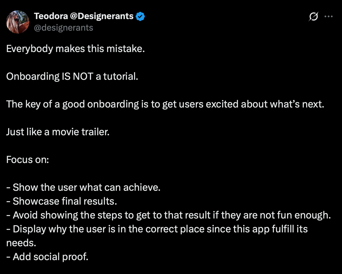
Just like a movie trailer.
🤯
That was it.
That made sense to me.
Less tutorial, more movie trailer.
This could be fun if I used that as my guiding principle.
And so this is what I came up with for spf.today & Lagree Buddy:
And for comparison, here’s what they used to look like:
(No video needed for these because there were no animations involved 😅)
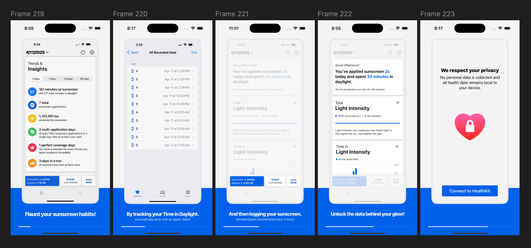
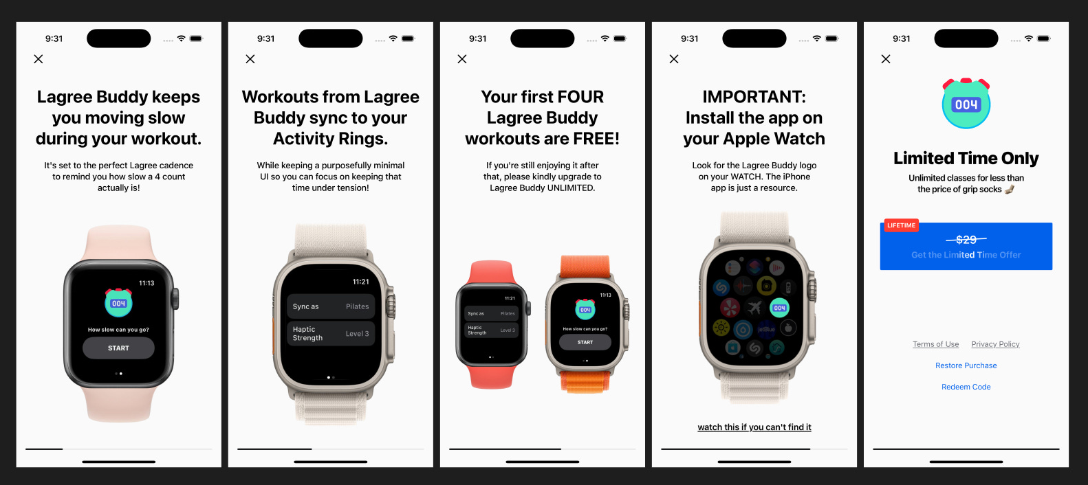
✅ Animations.
✅ Vertical scrolling1.
✅ And a little storytelling.
No longer just spewing features.
But (hopefully) building anticipation.
I also made one more change:
A hard paywall.
The era of giving away free shit is over (because we all gotta eat).
A hard paywall is a paywall that forces you to start a trial or make a purchase.
No free tier. No poking around. You’re either in or you’re blocked.
The “artist” in me hated it.
Like I said, I want my apps to speak for themselves.
I wanted people to try it, see the value, and then pay.
But this is probably also where the term “starving artist” comes from.
And the podcast states that most purchase conversions happen early in the funnel, not later. Because if users don’t see the value or offer immediately, they bounce and rarely return.
Yuck. I hate that I just used the word “funnel” unironically —
but such is the intersection of art and commerce2.
Ok, but did it make a difference?
I’m glad you asked.
spf.today’s onboarding overhaul shipped in late June.
Since then, there’s been a 5x bump in subscribers.
Plus, more than a handful of lifetime purchases.
🥳
Lagree Buddy’s new onboarding went live the first week of August.
That was only a week ago, but we are already at two-thirds of July’s total purchases.
🎉
Childish Folly did NOT get an onboarding overhaul, nor did it even get an onboarding because that app does speak for itself! If you watch Severance, you’ll get it. If you don’t, then go watch it!
🍉
Not an uncommon UX pattern anymore, thanks to TikTok, but I had never seen it used for onboarding. Shout-out to the Cappuccino app for showing me the way.
For reference, the 23:00 mark for one of the greatest interviews ever recorded: